The culmination of all the efforts put in
conducting a study is in obtaining the results of the study; hence,
while publishing the study one should be very attentive in writing the
Results section. In this series on reporting of research, the Journal
has previously published articles on writing the ‘Introduction’ and the
‘Methods’ sections [1,2]. We herein provide pointers to writing the
Results section, which is the cornerstone of a research paper where one
can highlight the achievements of the study – it is here that one
actually presents the painstakingly collected and analyzed data.
The skill of presenting the findings of one’s study
clearly and logically, so that it is easily understandable by the reader
(who has never been as involved with the study details as the
researcher) improves with practice. Many good studies are marred by
results that are described in a haphazard, directionless and
over-elaborative manner.
In this section, in addition to the text, tables and
figures are also used to communicate the content. When well-written,
this section can give a lucid picture of what the study is trying to
say. Data obtained from the study, when presented coherently, inspires
the readers’ confidence in the authenticity and robustness of the study.
It should be a step-by-step approach, taking the readers along the plan
of analysis that was described in the methods section. At the end of
this section, the readers should be able to draw their own conclusions
about the study findings.
What Should be Included in the Results Section?
Results section is a platform to narrate the
observations; no attempt should be made to explain the findings –
interpretations should be left for the discussion section. Similarly,
details of statistical tests, definitions, and plan of study should be
included in the methods section rather than the results section. The
guidelines for authors as per the targeted journal should be thoroughly
read and instructions followed. Results section is for reporting the
findings of your own study and not for any comparison with other
studies; however, in systematic reviews and meta-analysis, various
included studies’ pertinent results are presented. Do not give any data
which is not your own and for which a reference has to be cited.
A large amount of data may be generated in a study;
however, it is not wise to include all the data together. One has to be
careful as to how much of the data are presented. Too much of
information might obscure the pertinent findings, whereas too little
might render the study incomprehensible and unreliable.
General Style of Writing
The style of writing should be fluent and
uncluttered, without unnecessary use of adjectives and adverbs. Use past
tense when describing the results as all events being reported while
publishing the study has happened historically [3]. Write with clarity
and brevity, as shown in the following example:
(A) It is clearly seen that average weight of
children in group A is markedly higher than that of group B.
(B) The mean (SD) weight of children in group A
[16.5 (2.1) kg] was higher as compared to that in group B [10.3
(1.2) kg], P=0.04.
Sentence B is the more appropriate way of expressing
the result.
Organizing the Results to Make Them More Meaningful
The pattern of describing the results may differ in
its minutiae according to the study type and the journal. However, the
broad outlines are essentially the same. Qualitative studies have a
slightly different approach than quantitative studies; we will
concentrate on the latter in this paper.
Where to Start - Details of Study Subjects/Outline of
Study?
One should start with data regarding number of
patients/subjects enrolled. Numbers of potential subjects screened,
numbers excluded for not meeting study criteria, numbers randomized, and
numbers finally being analyzed along with numbers of trial deviates and
lost to follow up should be clearly mentioned; use of a flow diagram may
be useful. Following is an example to highlight these aspects:
"A total of 300 [175 (58.3%) girls] children with
tuberculosis, aged 6 months to 15 years of age, were enrolled after
screening 800 children attending the pediatric outpatient department of
our hospital."
Thereafter, a description of study subjects, the
demographic and clinical characteristics can be presented in the text or
in a table. Most editors/reviewers do not want the P value to be
written when presenting the baseline demographic characteristics of the
intervention and control arms of randomized controlled trials. Number of
participants with missing data for each variable of interest should be
indicated. Data regarding exposures and potential confounding factors
should be mentioned here.
Which Reporting Guideline to Follow?
The various guidelines for reporting studies as well
as the instructions to the authors by the journals should be closely
followed. Details of these guidelines can be obtained from the link:
http://www.equator-network.org/
The STROBE guidelines should be referred to in cases
of observational studies – both case control and cohort studies [4]. It
is advisable to include a flow diagram indicating the study outline. In
case of cohort studies and cross-sectional studies, number or the
summary measure of outcome events should be mentioned. In case control
studies, the numbers in each exposure category or summary measure
thereof should be reported.
In case of a randomized control trial, CONSORT
statement for reporting should be followed and a study flow diagram is
essential [5]. Dates defining the periods of study recruitment and
follow-up should be mentioned. If the trial is stopped prematurely,
reasons for doing so should be clearly specified. All adverse events,
even if unrelated to the study intervention should be mentioned in each
group.
While reporting diagnostic studies, the STARD
guidelines are to be followed [6]. A flow diagram can be included to
depict the enrollment of participants. The distribution of severity of
disease in participants with the target condition and alternate
diagnosis in those without the target condition has to be mentioned. A
2×2 table should be provided for the test result under study and the
reference or gold standard test. Diagnostic accuracy should be stated
along with the 95% confidence interval. Any adverse events encountered
while performing the test being studied and the reference standard
should be reported.
Presenting the Outcomes: The Sequence?
It is important to have a proper sequence for the
presentation of the observations of the study. Often, the authors
present the observations where the p value is the lowest/ significant.
At times, the presentation includes all the data collected with the main
outcomes coming somewhere in between. It becomes difficult for the
reader to follow such a haphazard arrangement.
Addressing the objectives
The primary objective of the study should be dealt
with in the beginning. The data should be so stated that the primary
question asked is answered clearly, using the statistical tests as
described in the methodology section. Refrain from presenting raw data.
Thereafter, the secondary outcomes, if any, should be presented.
Remaining data should follow the order as described
in the methodology section. It is advisable to go from the simpler to
more complicated results. Subgroup analysis should come in the last. Do
not describe any finding in the result section for which the methodology
and statistical analysis plan has not been stated in the methods
section. On the other hand, present all relevant results as mentioned in
the methodology section; do not exclude the observations from any test
or investigation which has been mentioned in the methodology section. In
case some post hoc analyses are performed, the same should be
stated explicitly.
Results section can be divided into subheadings
according to the objectives studied and analysis done, in order to
increase the clarity; however, the same should be done as per the
journal’s format.
Important Issues While Writing Results Section
Although you would like to write a comprehensive
results section and include all your study findings; frequently we miss
some essential attributes of this section. Some of these are (Box
1):
|
BOX 1.
Check These Before Finalizing the Results Section |
|
Decimal points
• Usually one or two places
after decimal point are sufficient.
• Be consistent with the
format.
Importance of P value
• Write the actual P
value.
• Never state a P
value as 0.000.
Choose your words carefully
• Be cautious while using the
word ‘significant’
Confounders
• Make clear which
confounders were adjusted for.
Negative results
• Always report the negative
findings as well.
Text – table dichotomy
• Avoid repetition between text and tables.
|
1. Decimal points
Usually the computer programs that we use for
statistical analysis will return results with a lot of digits after the
decimal point like 3.4562789. Do not report as such; round off to the
decimal point which reflects the sensitivity of your measuring
instrument or assay. For example, if the birth-weight is measured in
grams, then the mean value for the weight should have only one decimal
place rather than 2 or more decimal places. Usually one or two places
after decimal point are sufficient. However, one should be consistent
with the format which should be as per the journal’s requirement.
2. Importance of P value
The significance of the statistical tests applied is
usually presented as p values; the actual P value should
be written instead of just stating <0.05. Never state a P value
as 0.000 – this does not make sense even if the statistical program does
return such values; such values should be stated as <0.0001. Many
reviewers and journals nowadays prefer the 95% confidence interval over
the P values [5].
3. Choose your words carefully
One should be cautious while using the word
‘significant’ – in the results section, it denotes that the difference
is statistically significant and not by chance i.e. P<0.05. Do
not use the word if you find any difference which is not statistically
significant. However, do present the statistically non-significant data
as well. Defer from using words like ‘about’ or ‘approximately’ while
describing the results.
4. Confounders
In scenarios where confounders are expected to alter
the results, first give the unadjusted estimates and then the
confounder-adjusted estimates and their precision (e.g., 95% confidence
interval). Make clear which confounders were adjusted for and why they
were included; the process for the same should be described in the
methods section.
5. Negative results
The researcher is usually biased towards the positive
findings of his or her study. However, the negative results obtained
from the studies are equally important; they may help to prove or
disprove many proposed hypothesis. Remember to always report the
negative findings as well. Not reporting the negative results is
unethical and reduces the authenticity of the data.
6. Text – table dichotomy
Text and tables should be complimentary to each
other, not repetitive. Some salient features informing the reader as to
what is described in the tables can go in the text; rest can be depicted
in the table, for example:
"A total of 300 [175 (58.3%) girls] children with
tuberculosis, aged 6 months to 15 years of age, were enrolled. Mean (SD)
age of the children was 110 (15.3) months. Table … shows the baseline
characteristics of the enrolled children."
Tables
Tables are a good way of presenting large amount of
complicated data in a structured fashion. A lot can be communicated
through tables, but care should be taken so that the tables are simple
and comprehensible. The tables and text should not contain the same
detailed information, this is considered redundant. Only the key message
of the table can be concisely described in the text. The text should
always be linked with the table by referencing the table sequentially.
Depending on the journal, tables may be presented sequentially at the
end of the manuscript after the ‘References’, or located within the text
of your results section [7].
In a study with the objective to document the weight
gain at the end of 6 months of anti-tubercular therapy, the result can
be written as:
"At 6 months, median (IQR) weight gain was 3.5 (3.1,
4.7) kg and WAZ was 0.65 (0.59, 0.79). Change in WAZ was assessed at 2
and 6 months and are described in Table XYZ."
Number of tables
Number of tables to be included is primarily decided
by the requirement of the publishing journal. Usually a maximum of 3-4
tables should be sent. Remaining data may be submitted as supplementary
material in case of online publications.
Requisites of a good table
Each table should be complete in itself; one should
be able to read the table without taking help from the text. The
essential components of the table include a heading or legend, row and
column headers and footnotes. Heading should be short, specific,
descriptive, stating the key message to be enumerated in the table. Do
not use abbreviations in the heading. Each row and column header should
be able to explain what the row/column contains. The footnote should
contain the abbreviations mentioned in the table and any other
explanatory notes required. Always mention what summary statistic is
being presented like N (%), mean (SD) or median (IQR) and also the unit
of measurement. This can be mentioned in the appropriate column/row
header or in the footnote (Table I). Indicate number of
participants with missing data for each variable of interest. Do not
just give percentages if the denominator is less than 100, rather give
the actual observed values.
 |
When comparisons are being made, the data should
preferably be presented side by side.
Do not combine disparate variables in the same table.
If a table becomes too long, it is better to split into two for better
understandability.
Figures
Figure give a visual key which is usually appealing
to the reader. Decide which data can be best presented in the form of
figure; it is usually the important information which is presented in
this format – something which you want the readers to easily understand
and retain. Figures can be in color or grey tone. Almost all journals
charge extra for colored figures. Again the number of figures to be
included is to be decided as per the requirement of the publishing
journal.
Figures may range from simple line diagrams to
scatter plots to radiographs/images. Figure should also be complete in
itself with an informative heading with no abbreviations. Legends, data
labels, axis titles etc. should all be complete [7].
The text, table and figure should be complimentary to
each other and not mere duplication of data. Figures should be cited in
the text and should be numbered in the order of reference in the text.
All figures and pictures should be submitted as
separate files in the form of image file (.jpg, .ppt, .gif, .tif or
.bmp) with minimum resolution of 300 dpi to ensure good print quality;
the authors should refer to the target journal’s instructions to choose
the correct file type and the resolution.
Types of Figures/Illustrations
1. Photographic images: These images are
used to document observations such as clinical photographs of patients;
data of imaging investigations such as radiographs, ultrasonography
images, CT scan/ MRI scan images, radionuclide studies; intra-operative
findings; surgical specimen; pathology images- cytopathology,
histopathology, special stains, immunohistochemistry, etc.; laboratory
investigations such as PCR results, gel/ blot images; tracing of
investigations such as ECG, EEG, EMG, etc.
Images should be of good quality, maintaining the
original proportions (not unnaturally distorted), cropped to delete
unnecessary details and labeled properly. If you plan to include
photographs of your patient, proper written consent should be obtained
beforehand. Patient confidentiality is of paramount importance and all
attempts should be made to protect the identity of the person like
covering the eyes. The pictures should also have a legend describing
what is being portrayed. At times, it is useful to combine many images
in a single figure, e.g. CT scan/ MRI scan images; each of the images
should be identified separately. Use of arrows or other markers may be
helpful to highlight important findings.
2. Graphs/data chart: Data charts can
effectively summarize numerical data for better presentation.
Choosing the right type of graph for your data is
critical. The right graph depends on a number of factors like the type
of data (continuous or categorical), the number of groups or variables
involved and the intent of creating the graph. When one wants to
demonstrate the composition or break up of a data set or groups within
the data set, one can use pie charts or stacked bar charts. In order to
show comparison between data, you can use bar charts or line plots. Line
plots can be used to depict time trends. Distribution of data can be
demonstrated by histograms, scatter plots. Overlapping of data can be
picturized by Venn diagrams. The relationship or correlation between two
variables can be demonstrated by scatter plots. Commonly used data
charts are:
(a) Pie chart: Pie chart shows classes or
groups of data in proportion to the whole data set. They are usually
beneficial to depict large data sets, e.g. epidemiological surveys (Fig.
1). These are best used when the number of classes/ groups are
3-10. One should avoid using the pie chart where there are only 2
groups, e.g. gender.
 |
|
ppd: progressive pulmonary disease; ppc: primary pulmonary
complex; pe: pleural effusion.
Fig.1 Pie chart depicting the diagnosis
of enrolled chilren with tuberculosis.
|
(b) Bar charts: Bar charts may be horizontal
or vertical. The height or length of the bars represents the
measurement. By this method the same variable can be compared across
groups or time points (Fig. 2). Stacked bars can also be
made to make intra-group comparisons like in males and females or to
show the composition of each group. It is better not to compare two
variables in the same chart if values of one variable overshadows or
dwarfs the other. Also it is prudent to avoid clubbing too many
variables or categories in the same chart- this makes the chart
unreadable. If there are more than 5 groups to be compared, better to
use horizontal bar charts.
TST: Tuberculin skin test; QFT: Quanti FERON gold in tube
test.
|
|
Fig.2 Comparison of tuberculin skin test and
QuantiFeron Gold In-tube test in children with probable and
culture confirmed intra-thoracic tuberculosis.
|
(c) Histogram: In a histogram, the entire
range of a continuous variable is divided consecutively into
non-overlapping groups known as class intervals. The height of the
vertical rectangles for each class interval represents the frequency or
density of the variable, depending upon whether the class intervals are
of equal or unequal width.
(d) Scatter plots: Scatter plots can be used
to present measurements on two or more variables that are related; the
values of the variables on the y-axis are dependent on the values of the
variable plotted along the x-axis (Fig. 3).
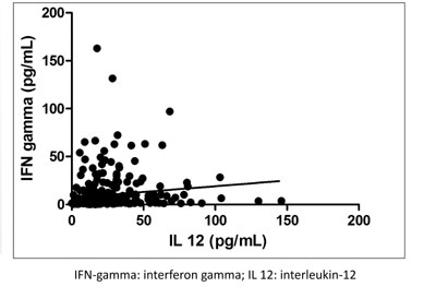 |
|
Fig. 3 Scatter plot showing the
relation between serum interferon-gamma and interlaukin-12 level
in 150 neonates at baseline.
|
(e) Line plots: Line plots are similar
in some ways to the scatter plots, with the condition that the values of
the x variable have their own sequence (Fig. 4). Line
plots can be used to depict time trends.
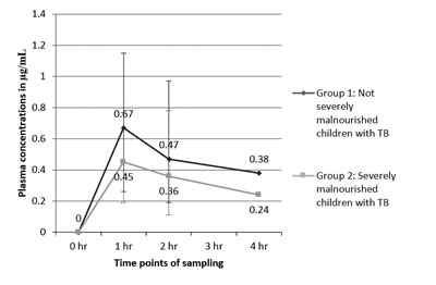 |
|
Fig. 4 Comparison of plasma
concentrations of isoniazid in children with tuberculosis, with
or without severe malnutrition.
|
(f) Box plots: Box plots are used to depict
the numerical data in the form of median and interquartile range (which
forms the box); sometimes whiskers are added which may denote the
maximum and minimum value. Outliers can also be depicted in the box plot
(Fig. 5).
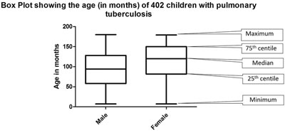 |
|
Fig. 5 Summary of age of 402 enrolled children with
pulmonary tuberculosis.
|
(g) Venn diagram: A Venn diagram is a
type of chart that shows how different data sets relate to or overlap
each other through intersecting portions of circles.
(h) ROC curves: Receiver Operating
Characteristic curve is a plot of the true positive rate (sensitivity)
against the false positive rate (1-specificity) for the different
possible cut-offs of a diagnostic test. The area under the curve is a
measure of accuracy of the test under question.
(i) Forest plot: Forest plot is a
graphical presentation of the results of meta-analysis, where the
individual estimated effect of the included studies with the same
objective is portrayed along with the cumulative effect.
Value of Revision
Finally, check and recheck your data. There should
not be any discrepancy or inaccurate reporting. Discrepancies within the
result section leave a bad impression on the reviewer, and question the
reliability of the data.
You may want to get your result (or the whole paper)
reviewed by a colleague before submission to any journal – a neutral
perspective often brings out many flaws which are not visible to the
author himself.
Common Errors
Box 2 lists some of the commonly encountered
errors in the Results section. Enough attention should be paid to avoid
these errors.
|
BOX 2.
Common Errors Encountered in Results Section |
|
In text
• Presenting the data
haphazardly, not following the order mentioned in the
methodology section.
• Trying to explain the
results, giving one’s own interpretation instead of stating the
facts.
• Providing too little or too
much information.
• Not reporting the negative
findings.
In tables
• Duplication of information
in text and tables.
• Table not complete in
itself.
• Disparate characteristics
and comparisons clubbed together in one table.
• Not linking the table with
the text with proper reference and in the right chronological
order.
• Inaccurate arithmetic –
numbers do not add up.
In figures
• Graph not plotted to scale.
• Data not properly labeled.
• Omission of proper legends.
• Data not consistent with
text.
• Not linking the table with the text with
proper reference and in the right chronological order.
|
Summary
The results section is the platform where the
researchers present their data in an informative and lucid manner for
the understanding of the readers. No explanation or interpretations are
to be presented in this section. Properly labelled tables and figures,
chosen according to the data types, add to the value of this section.
The sequence of the presentation of results should always follow the
order mentioned in the methodology section. The primary objective of the
study should be addressed up-front and with utmost clarity. Maintaining
the accuracy and authenticity of the data presented is sacrosanct.
References